Double Cheese Hamburger T-Shirt
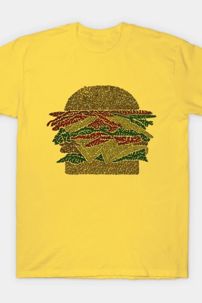
So when I first started with this style my intention was to see images differently. So instead of drawing a hamburger, I have the positive and negative spaces that make up the individual elements separated. So instead of a typical bun we have the positive and negative spaces that make up the bun. It makes for interesting coloring. In this design only the positive space is colored in.
Double Cheese Hamburger T-shirt

Double Cheese Hamburger T-shirt
from TeePublic
Appears in Foodie
So when I first started with this style my intention was to see images differently. So instead of drawing a hamburger, I have the positive and negative spaces that make up the individual elements separated. So instead of a typical bun we have the positive and negative spaces that make up the bun. It makes for interesting coloring. In this design only the positive space is colored in.

